 The Hundred Chart has been used for years to help young students build a mental model of the structure of our number system and to help develop their number sense. Unfortunately, the conventional and most commonly-used version of the Hundred Chart isn’t as good a model as it could be, because of three problems. The first two, and their relatively easy fixes, were pointed out to me by Paul Goldenberg. The third problem is not quite as easy to fix.
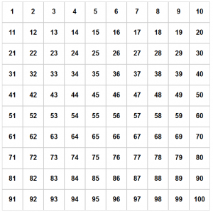
Top-Down vs. Bottom-Up: The conventional top-down Hundred Chart shown at right starts at the top left and reads to the right and down, matching the way students read books and worksheets. But this introduces confusion: numbers go up as students move down on the page, leaving the model’s physical directionality (20 is lower than 10) opposite to the conceptual directionality of the number system (20 is a higher number than 10). Far better to use a bottom-up Hundred Chart in which the numbers go up as students move up the chart. (See the NCTM article A Bottom-Up Hundred Chart by Jennifer Bay-Williams and Graham Fletcher.)
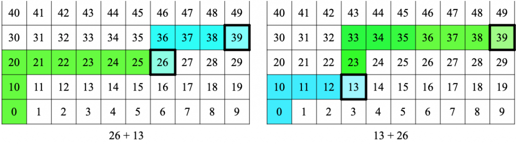
Starting Place: 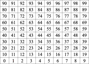 The conventional chart starts with 1, but lacks a starting place, an origin. This is a mismatch with the structure of the number system. Consider these examples: (a) If you’re measuring the classroom width in paces, you count 1 at the end of the first pace. If you’re putting 5 blocks in a container, the container has 1 block only after you’ve placed the first block. A new-born baby isn’t 1 year old. (b) The first row contains 1 to 10, the second row has 11 to 20, etc. But we naturally think of the 20’s as the numbers from 20 to 29, not the numbers from 21 to 30! (c) Students typically show a problem like 26 + 13 by starting on the 26 square and marking a path going up 1 and right 3 , and they show 13 + 26 by starting on the 13 square and marking a path going 2 up and right 6. The paths shown for these two problems don’t relate to each other. But with an origin, students mark two paths for each problem (with the first from the origin to the first addend), so the relationship between the two problems appears clearly in the shapes of the paths.
(These images were created using an earlier sineofthetimes blog post.)
To fix this structural issue, we need to add a starting place, an origin, so that 1 is a step away from the start, just as 2 is a step away from 1. The origin could be left blank, but there’s no harm done by labeling it 0. (Kids understand that a container is empty until they put an object into it, and that a baby isn’t one year old until a whole year after being born.) Adding the origin, the 0 square, at the bottom left also puts the chart in sync with place value: for every square in the chart, the column number (from 0 to 9, left to right) is the digit the 1’s place and the row number (from 0 to 9, bottom to top) is the digit in the 10’s place.
Adding an origin square has another benefit: it puts the number chart in sync with other representations students will encounter later, including integer number lines, open number lines, and Cartesian graphs. (For instance, the moves on the bottoms-up 99 chart correspond to jumps of size 1 and 10 on an open number line.)
Discontinuities: The discontinuities from the end of one row to the beginning of the next are jarring: why does adding 1 to 29 make us jump left all the way to the other side of the chart, and up one row as well? Sure, we explain this weirdness to students, or (better) get them to explain to us, by asking “Why is adding 1 to 29 so different from adding 1 to 28?” This discontinuity is an artifact of our place-value Arabic notation; it’s not inherent in the numbers themselves. But how to fix it?
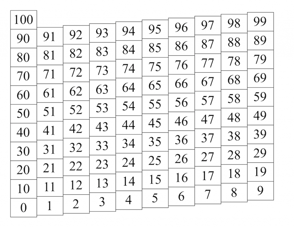
The appropriate solution, it seems to me, is to change our model a bit, by rolling the paper chart to put the 9 in the bottom row next to the 10 in the second row. This works best with the chart shown below, with the 1’s column slightly higher than the 0’s column, and similarly across the chart.
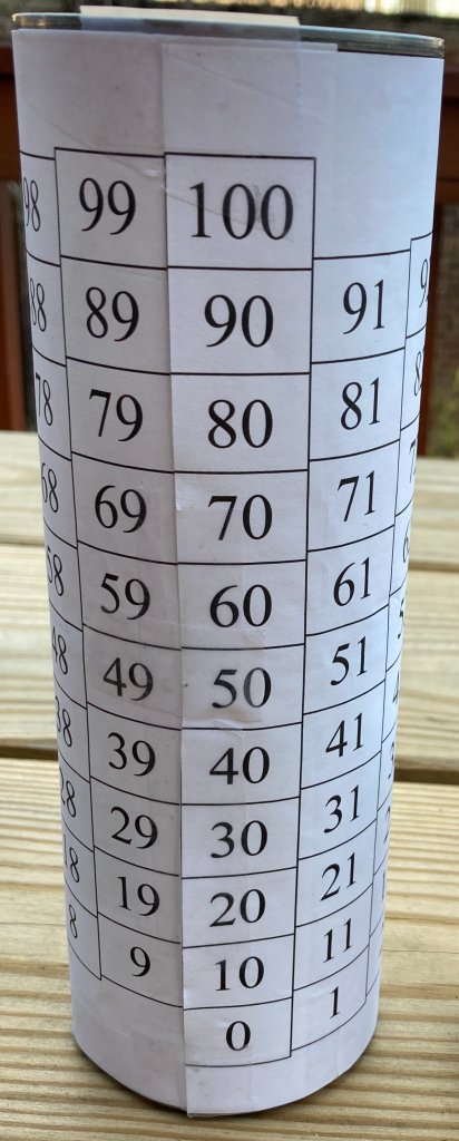
Print this pdf (in landscape mode) for a full-page chart, or this pdf (in portrait mode) for two smaller charts on a page. To roll a chart, first cut off its left border (along the left edge of the 0’s column). Then roll and tape it so the 0’s column is just to the right of the 9’s column, with the 10 square slightly higher than the 9 square.
Except for one small problem, this is a great solution. The numbers are continuous on the rolled chart, forming a helix on the surface of the cylinder. The square for 30 is in the same relation to 29 as 29 is to 28, and so on, up and down. What’s more, this helical chart honors the number-sense idea that 6 is “higher” than 5, putting 6 just one small step up from 5. And the helix itself is in fact the number line, wound counter-clockwise around the cylinder.
The problem with the helical number chart is that it’s three-dimensional: the helix has to be assembled, and once assembled it doesn’t fit neatly on students’ desks for them to write on.
But this overstates the problem, because students can visualize the helical chart after assembling a few. The cutting, rolling, and taping they’ve already done enables them work on a flat-paper version while remaining aware of how one edge connects to the other. They can always roll their paper into the helical form (without the cutting and taping steps) to remind themselves of how it all fits together.
Problems and Patterns: Helical number charts can be substituted for traditional hundred charts in any assignment, activity, or problem that uses number charts. Print either the single-chart pdf (in landscape mode), or the double-chart pdf (in portrait mode) to use as student worksheets.
A Durable Helix: The rolled paper model doesn’t hold its shape very well and is easily crushed or folded. A valuable resource for students working with the Helical Hundred Chart is to have each student or group prepare a more durable physical model to use as a reference while they’re doing their actual work on flat printed sheets. It’s fairly easy to construct a large durable helix for you to use for demonstrating, and have each student or group construct a small durable helix for their own reference.
Large Durable Helix: To make this helix, print the single-chart pdf in landscape mode at approximately 95% scale, and trim the top, left, and bottom borders. You’ll wrap this chart around a stack of two empty #1 cans. (This can size is commonly used for various kinds of beans, diced tomatoes, etc., and is about 7.5cm in diameter by 11.3 cm high.) Stack the two cans and tape them together, cut off the left border as described above, and tape the middle of the 9’s column to the middle of the stack of cans. Roll the paper snugly around the cans, and tape the top and bottom corners (next to the 0 and 100 squares) to keep it in place. (If the 0’s column and the 9’s column overlap, or if there’s a gap between them, adjust the printing scale to get a snug fit.)
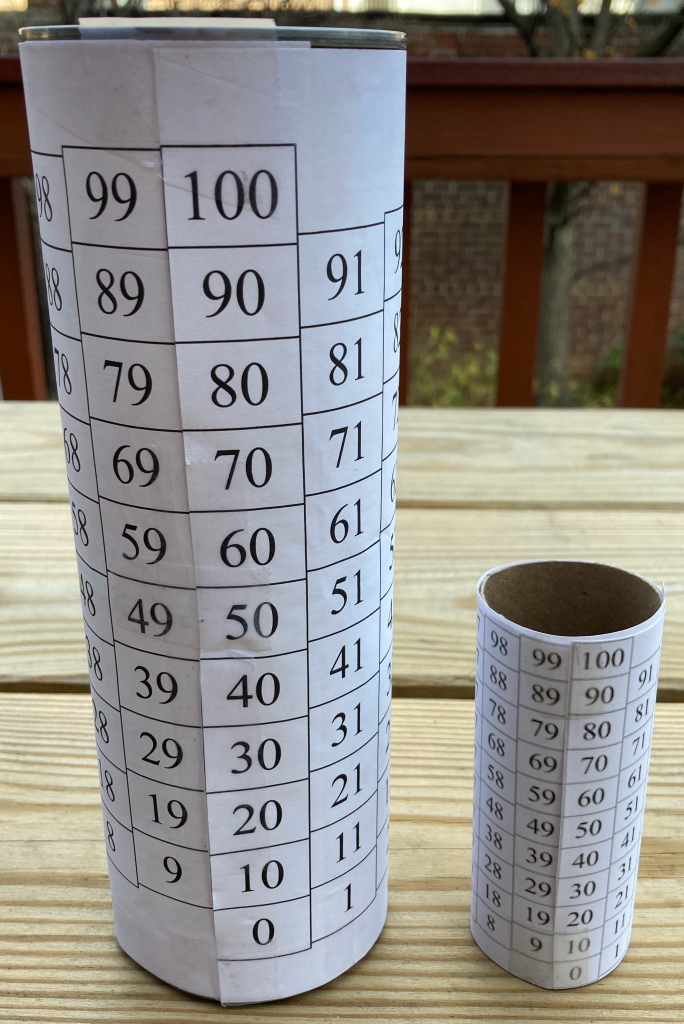
Small Durable Helix: To make this helix, use the double-chart pdf and wrap one of the charts around an empty toilet-paper roll. Trim the top, left, and bottom borders of one of the charts, and use tape to attach the chart to the roll as described above.
Students will find their durable helix useful for reference as they solve various problems or create various patterns on their flat paper charts.
Even in a virtual instruction environment, students can build the physical model at home using an empty TP roll and a printed copy of the chart; in the worst case you can show it to them via video-conference, and they can use an online chart (such as this interactive one) to actually show the paths for addition or subtraction problems, just as I did for the 26 + 13 example above. Though these charts still have the discontinuity between their right and left edges, students’ experiences, either seeing you demonstrate the helix or building one themselves, will be a help to them in visualizing how moving forward (right) from 39 lands on 40.
You and your students are welcome to use any of these resources (the single-chart pdf , the double-chart pdf, and the interactive number-chart web page). We hope you find them useful!
[Added 12/13/20: I just learned that Jessica Boschen proposed essentially the same idea back in 2013. I want to express my thanks to her for thinking of this seven years ago, and I also want to express my frustration that so many students today are still using number charts structured differently, in one way or another, from the actual structure of our number system!]
I love the physical model for this! I feel like a TP roll version feels more right for objects I easily have around the house (and don’t have to rinse out gunk). I’d love to see a TP-sized PDF. 🙂
Good suggestion, Kendra. I took it and ran with it, as you can see from the picture as well as from the new double-chart pdf.
I am so excited to try the helix model with my students. If you end up making a video of yourself modeling the can-covering format, that would be amazing. Just a little nudge. 🙂 Thanks for all your great ideas!